Embroker UI Toolkit
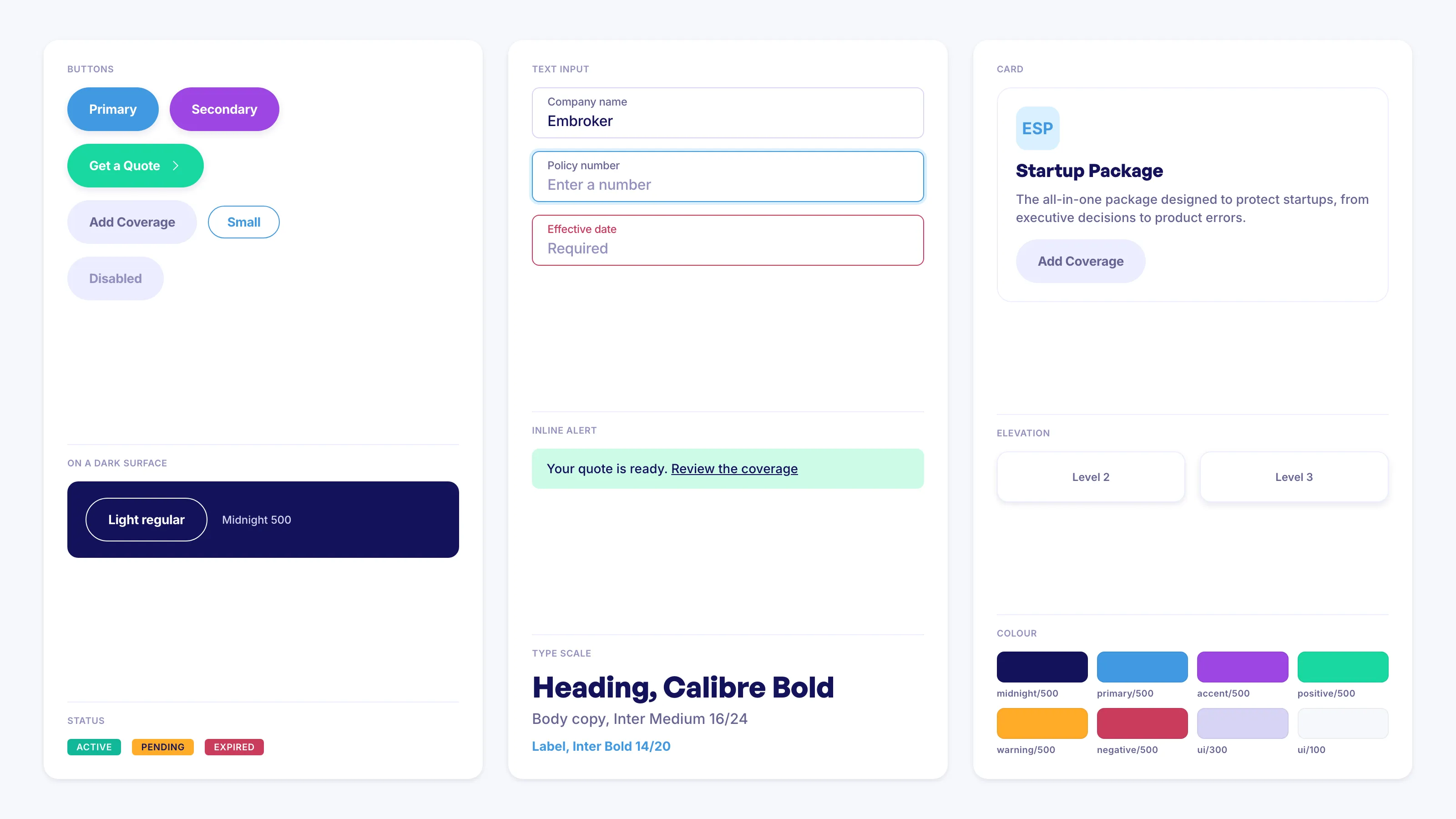
The Mileva design system: a ~100-component library powering Embroker's insurance platform.
Problem
Embroker’s digital insurance platform ships across two products, the customer web app and the internal admin interface, and both need to speak one visual language: Mileva, the company’s design system. A design system is only as real as its implementation. It needed a dedicated owner: components that are consistent and accessible, documented well enough that feature teams can build without guessing, and stable enough that a design change doesn’t ripple into regressions.
Solution
With a small dedicated team, I managed the Embroker UI toolkit, a library of around a hundred React and TypeScript components, each documented in Storybook. The work was equal parts building and stewardship: shipping components requested by the Design, CXI and feature teams, and keeping the foundation trustworthy as it grew.
The trust came from a layered testing setup I put in place in CI:
- Chromatic for visual regression: every component change is diffed against its approved baseline before it can merge
- Storybook interaction tests: behavioral coverage living in the same stories that document each component
- Jest + React Testing Library unit tests underneath
Along the way I also upgraded all three webpack configurations from webpack 4 to webpack 5 for better performance and compatibility.
Outcome
The toolkit is the foundation both the Embroker web app and the admin interface are built on. Design decisions flow through one library instead of being re-implemented feature by feature. Recent product work, like the Law Bundle MVP, was built on top of it.